RWD 響應式網站設計
為什麼選擇 RWD 響應式網站設計?
Why Choose RWD Responsive Web Design?
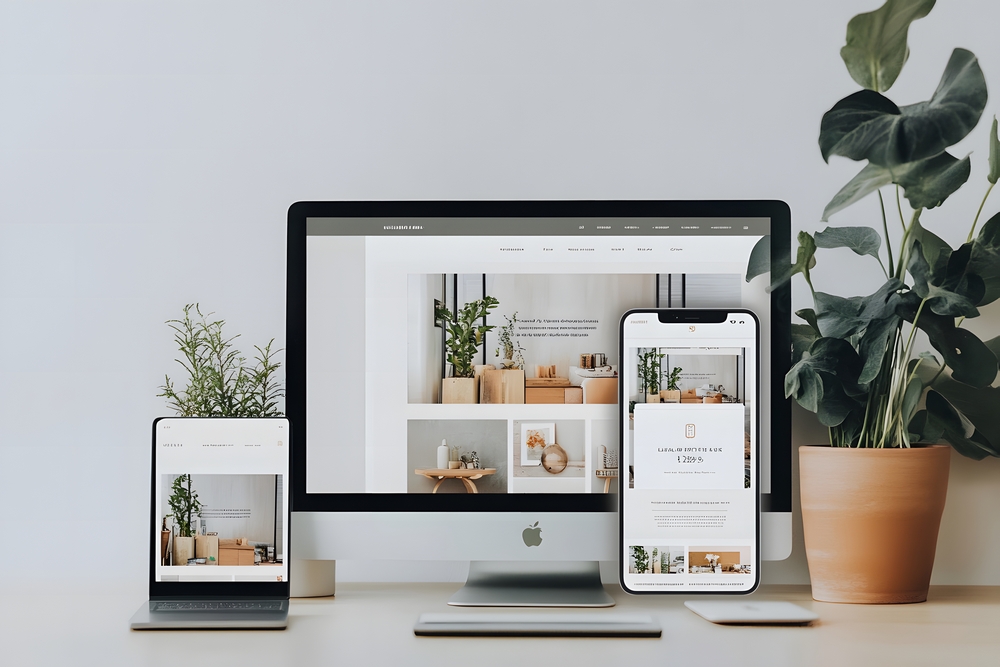
RWD(Responsive Web Design)響應式網站設計 是現代網頁設計的核心技術,能確保您的網站在各種設備上都能提供卓越的使用體驗。無論是桌面電腦、平板電腦還是手機,RWD 能自動調整網站的佈局和內容,完美適應不同螢幕尺寸與解析度。
RWD (Responsive Web Design) is the core technology of modern web design, ensuring that your website delivers an exceptional user experience across various devices. Whether it's a desktop computer, tablet, or smartphone, RWD automatically adjusts the layout and content of the site, perfectly adapting to different screen sizes and resolutions.
在這個多樣化設備的時代,網站設計已不僅限於桌面端的顯示,響應式設計已成為現今網站設計的標準。隨著移動設備使用量的急劇增加,無論您的用戶身處何地,無論他們使用什麼設備,網站必須能順暢運行,提供一致且高效的瀏覽體驗。
In today’s diverse device landscape, website design is no longer limited to desktop displays. Responsive design has become the standard in modern web design. With the rapid increase in mobile device usage, it is essential that your website operates smoothly across all devices, providing a consistent and efficient browsing experience for users, no matter where they are or what device they are using.
增強用戶體驗,提升轉化率
Improve SEO Performance and Achieve Long-Term Growth
RWD 的優勢不僅在於提供靈活的網站佈局,還在於其能動態調整圖片、文字排版和導航結構,讓內容在不同裝置的螢幕上都能清晰易讀,並保持一致的品牌形象。這意味著無論您的訪客是使用手機還是桌面電腦,都能獲得同樣優質的瀏覽體驗,進而提升網站的訪問量與轉化率。
The advantages of Responsive Web Design (RWD) go beyond flexible layouts. RWD dynamically adjusts images, text formatting, and navigation structures to ensure that content remains clear, readable, and visually consistent across all devices. This means whether your visitors are browsing on a smartphone or a desktop computer, they’ll enjoy the same high-quality experience, helping to increase both website traffic and conversion rates.
提升 SEO 表現,實現長期增長
Enhance User Experience, Boost Conversion Rates
響應式設計不僅有助於提升用戶體驗,還能顯著改善您的SEO(搜尋引擎最佳化)表現。Google 和其他主要搜尋引擎傾向於優化響應式網站,這意味著選擇RWD能幫助您的網站在搜尋結果中獲得更高的排名,並且提高網站在移動端的可見性。事實上,響應式設計已經成為 Google 排名的一個重要因素。
Responsive web design not only enhances the user experience but also significantly improves your SEO (Search Engine Optimization) performance. Google and other major search engines favor responsive websites, which means that choosing RWD can help your site rank higher in search results and increase its visibility on mobile devices. In fact, responsive design has become a key ranking factor in Google’s algorithm, making it essential for brands looking to grow sustainably online.
RWD:面對未來的網站設計解決方案
RWD: The Future-Ready Solution for Web Design
隨著數位化轉型的加速,網站不再僅僅是一個在線名片,它是品牌與顧客溝通的橋樑。選擇RWD設計,您不僅能夠提供優質的瀏覽體驗,還能在激烈的市場競爭中脫穎而出。RWD 能夠幫助您吸引更多的移動設備用戶,同時提升整體網路形象,進一步強化品牌忠誠度,成為未來商業發展的強大基礎。
As digital transformation accelerates, a website is no longer just an online business card — it’s a vital bridge between your brand and your customers. By choosing Responsive Web Design (RWD), you not only deliver a high-quality browsing experience but also stand out in a competitive market. RWD helps you attract more mobile users, enhance your overall online presence, and build stronger brand loyalty — laying a solid foundation for future business growth.
網站製作流程
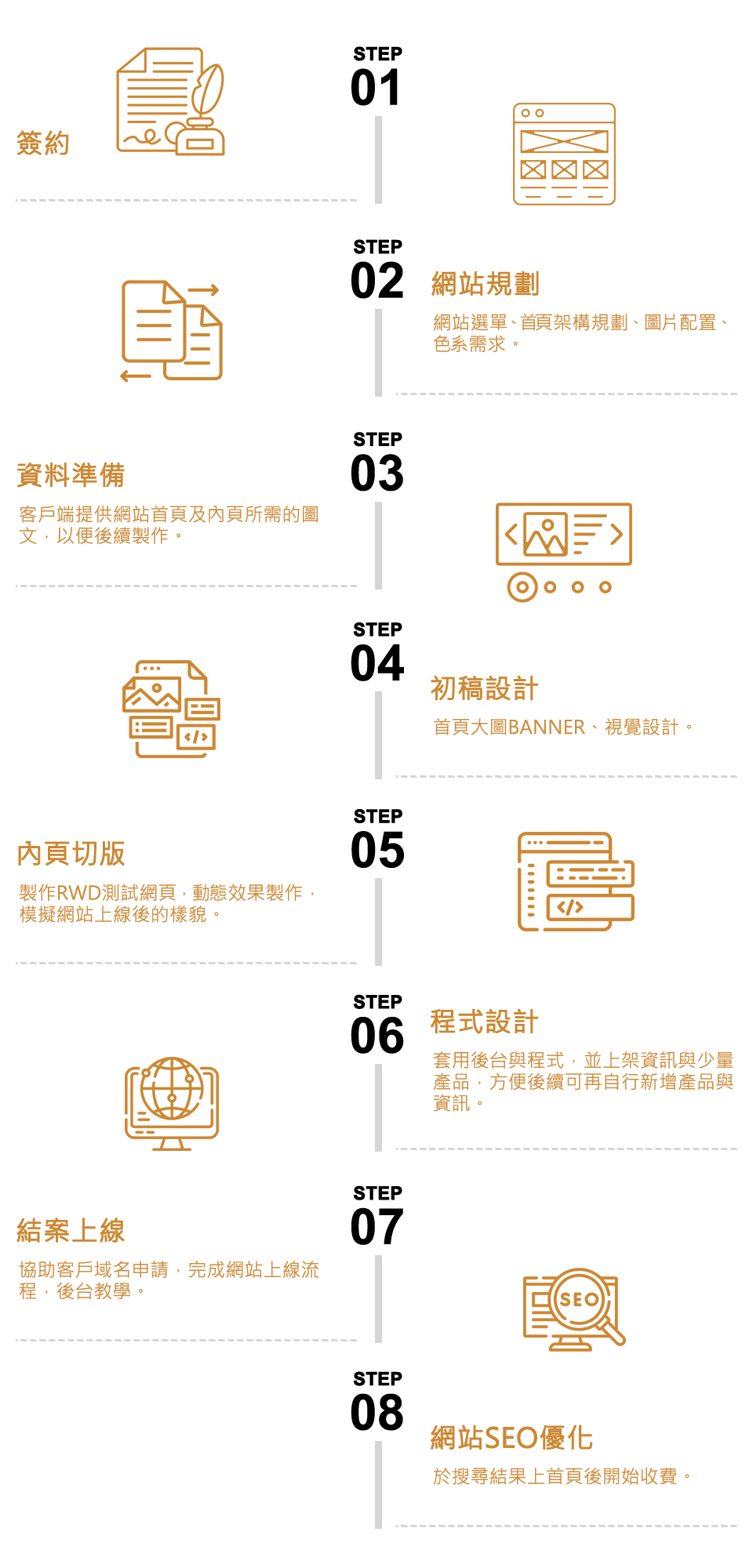
※製作時間取決於「資料提供的速度」、「修改次數」、「校稿時間」…等因素而定,皆依照排程進行。
如有特殊需求,須提前完成,可先告知,以便協助。